
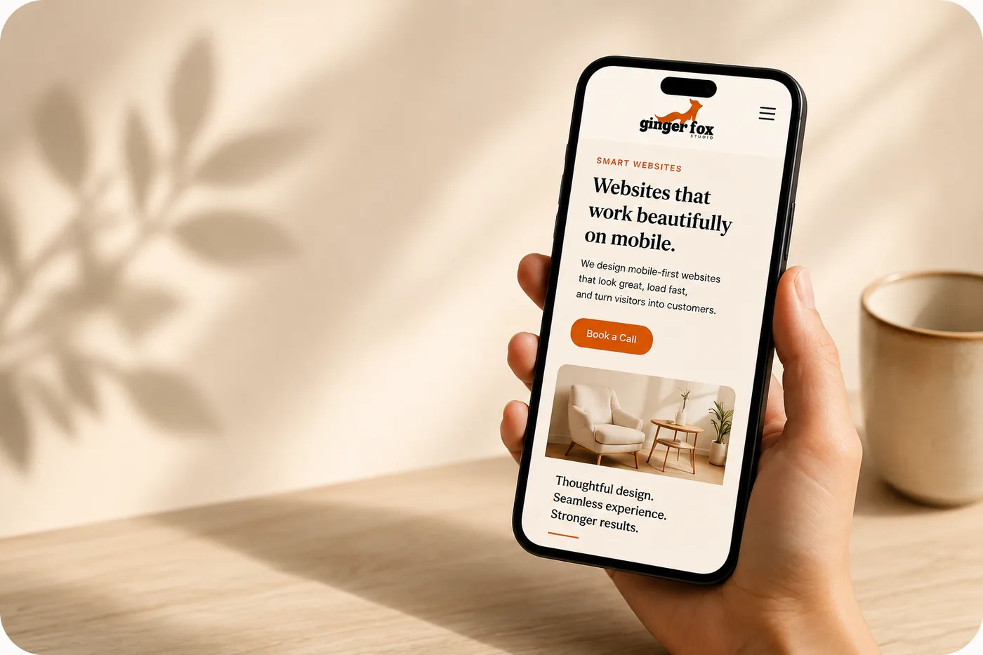
Open your website analytics right now, if you have them, and check one number: what percentage of visitors are on a phone. For most Singapore SMEs it's somewhere between 65% and 85%. Yet a surprising number of business websites are still designed on a desktop, checked on a desktop, and only glanced at on a phone as an afterthought before launch.
That gap between where customers actually are and where a website is designed for is quietly costing enquiries every day. Mobile-first isn't a design trend or a technical checkbox — it's simply building your website for the device your customers are actually holding. Here's what that really means and how to get it right.
"Mobile-friendly" is not the same as mobile-first
Most website builders will tell you their templates are mobile-friendly, and technically that's true — the layout won't break on a small screen. But mobile-friendly usually means a desktop design that's been squeezed to fit, with the same amount of text, the same number of buttons, just rearranged into a single column.
Mobile-first means the opposite process: you design for the small screen first, deciding what's essential, and then adapt that up to desktop — not the other way round. It forces harder decisions early, about what actually matters on the page, instead of cramming everything in and hoping it still works when squeezed.
The quick test
If your homepage makes more sense on a laptop than on a phone — longer paragraphs, smaller buttons, a busier layout — it was built mobile-friendly, not mobile-first.
Why this matters more in Singapore than almost anywhere
Singapore has one of the highest smartphone penetration rates in the world, and local search behaviour reflects it: customers look up a business, check reviews, and message on WhatsApp, almost entirely from their phone, often while standing outside the shop or mid-conversation with a friend deciding where to eat.
- Google increasingly ranks and evaluates sites based on their mobile version, not desktop — a slow or clumsy mobile site can hurt your search ranking even for desktop searchers.
- Local intent searches ("near me", "open now", "delivery") are almost exclusively mobile.
- WhatsApp is the default way Singaporean customers expect to contact a business — and that only works smoothly from a phone-optimised site.
In other words, mobile isn't a secondary audience to accommodate. For most SMEs here, it is the primary audience, and everyone else is the exception.
What this looks like in real numbers
A tuition centre in Bukit Timah checked their analytics and found 78% of website visits came from a phone, mostly parents browsing during commute hours or while waiting to pick up their kids. Their enquiry form, however, was a desktop-style multi-step form that took over a minute to complete on a small screen. After switching to a three-field mobile form with a WhatsApp option, monthly enquiries rose from around 15 to over 30 without any change in ad spend.
What a genuinely mobile-first site actually looks like
Layout and content
- Short paragraphs — two to three lines maximum before a break.
- One clear message and one call to action per screen's worth of scrolling.
- The most important information (what you do, where you are, how to contact you) visible without scrolling.
- Images that load fast and don't push the text you actually need to read further down.
Navigation and buttons
- Tap targets big enough for a thumb, not a mouse pointer — at least 44x44 pixels.
- A sticky or easily reachable call, WhatsApp or enquiry button, not buried at the bottom of the page.
- A simple menu — a hamburger icon with a handful of clear options, not a dropdown with fifteen items.
Forms
- Three to five fields maximum for an enquiry form — name, contact, message is often enough.
- Fields that trigger the right keyboard (number pad for a phone field, email keyboard for an email field).
- No forced account creation before someone can ask a simple question.
Speed is a mobile-first issue, not just a technical one
A desktop on office WiFi can hide a poorly optimised website's sins. A phone on mobile data outside a shop cannot. Every extra second a page takes to load on mobile costs you a measurable share of visitors, and Google factors mobile speed into search rankings directly.
| Load time on mobile | Typical visitor drop-off |
|---|---|
| Under 2 seconds | Baseline — most visitors stay |
| 3 seconds | Around 30% more likely to leave |
| 5 seconds | Around 90% more likely to leave |
The most common culprits are uncompressed images, embedded videos that autoplay, and too many third-party scripts (chat widgets, tracking pixels, font loaders) all fighting to load at once. Fixing these is usually a technical afternoon's work, not a redesign.
As a rough benchmark, an uncompressed photo straight from a modern smartphone camera can be 4–8MB. On a page with five such images, a visitor on mobile data could be waiting on 20–40MB just to see photos — often costing them real mobile data as well as time. Compressing the same images typically brings that down to under 2MB total with barely any visible difference in quality.
Mobile-first and WhatsApp go together
For most Singapore SMEs, WhatsApp is where enquiries actually turn into sales, not a contact form. A mobile-first website should treat WhatsApp as a first-class contact method, not an afterthought icon in the footer.
WhatsApp done properly on mobile
- A visible WhatsApp button on every page, not just the contact page.
- The button opens a chat with a pre-filled message so customers don't have to think of what to say.
- The button is placed within thumb's reach — bottom of the screen, not top corner.
- Response expectations are set clearly ("we usually reply within the hour, 9am–6pm") so customers aren't left guessing.
Common mistakes that undo a mobile-first design
- Pop-ups that cover the entire screen on mobile with a tiny, hard-to-find close button.
- Image carousels that require precise swiping and often break on touchscreens.
- Phone numbers written as an image instead of a tappable link.
- Text sized for desktop reading distance, forcing pinch-zooming on mobile.
- Videos that autoplay with sound and eat mobile data before a visitor can stop them.
- Menus with nested dropdowns that are fiddly to navigate with a thumb.
Practical example: a spa business had a beautiful desktop homepage with a full-screen promotional pop-up. On mobile, the same pop-up covered the entire screen with a close button the size of a full stop. Bounce rate on mobile was nearly double desktop — visitors simply left rather than hunting for the exit.
How mobile-first design changes conversion, not just appearance
It's tempting to treat mobile-first as purely a cosmetic concern — does it look tidy on a small screen. In practice, it changes actual business outcomes, because the friction points on mobile are exactly where paying customers give up.
A renovation contractor tracked their enquiry funnel closely for two months. On desktop, roughly 6% of visitors who reached the contact page submitted a form. On mobile, the same page converted at just 1.5% — the form required scrolling past ten fields and pinch-zooming to read labels. After cutting the form to four fields and adding a WhatsApp shortcut above it, mobile conversion rose to 5%, nearly matching desktop.
The lesson generalises well: mobile visitors are not less interested than desktop visitors, they simply give up faster when something is awkward. A mobile-first site removes that awkwardness, which shows up directly as more enquiries and more sales from the same amount of traffic.
How to actually test whether your site is mobile-first
Resizing a browser window on your laptop doesn't count. You need to test on an actual phone, on actual mobile data, the way a real customer would.
- 1Turn off WiFi and load your site on mobile data.
- 2Time how long it takes before you can read the headline.
- 3Try to complete your own enquiry form or WhatsApp button one-handed.
- 4Ask someone unfamiliar with the site to find your price and contact details within 15 seconds.
- 5Run the page through Google's PageSpeed Insights and check the mobile score specifically, not just desktop.
If you or a stranger can't find your price, your service area and a way to contact you within 15 seconds on a phone, the site needs work regardless of how it looks on a laptop.
Frequently asked questions
Isn't a responsive website already mobile-first?
Does mobile-first mean my desktop site will look too basic?
How do I know if my current website has a mobile problem?
Is mobile-first only about layout, or does it affect content too?
How much does it cost to fix a mobile-first problem?
Should I worry about tablet users too, or just phones?
Not sure how your site performs on mobile?
We'll run a quick mobile check on your current website and tell you honestly what's costing you enquiries — no jargon, just a clear list of fixes.
Get a Free Mobile Check